

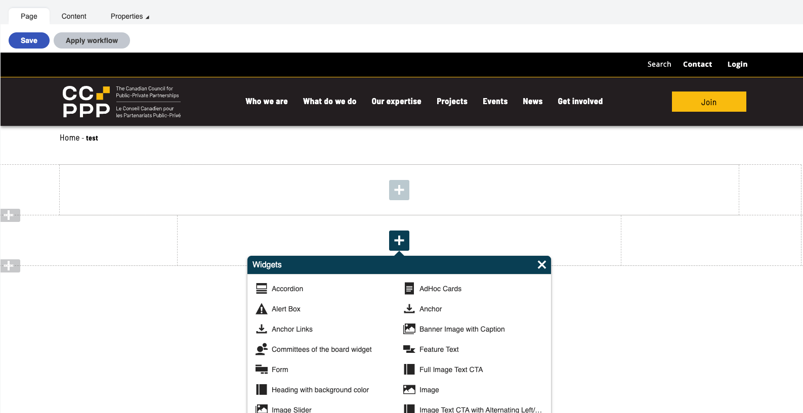
The page builder is a customizable drag and drop interface that will let you design the content of pages with the use of sections and widgets.
To access the page builder:
The "Page Builder" consists of a series of containers and blue or grey boxes with "+" icons in them. The grey + boxes on the left hand side of the viewport allow you to add sections. These sections are pre determined based on the design of the site and contain styling options.
Sections:
Single Column full width - this is used for content that stretches the full width of the screen
Single Column narrow width - this is used for centered content and optimized for text
Single Column max width - this is almost like the full width section but with a bit of padding on both sides
Two Column with Side Navigation - used with the settings in the "content" tab to include side navigation items.
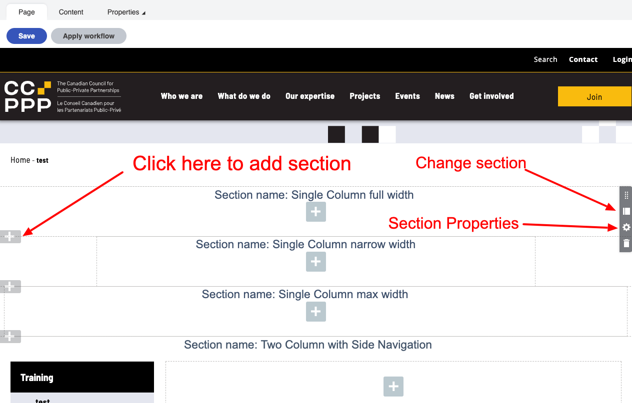
Properties can be adjusted for section types by hovering over the section type and clicking on the gear icon in the dark grey box for the section:
.png)
By default the section properties will remove top margin. If you deselect this there will be space added to top of the section.
Position from bottom and position from right position from the top are used for positioning the square image. If you add in a number on any of these items it will position the image that many pixels from the reference point.
For example: a value of 200 in the "position from the right" field will position the squares 200 pixels from the right side of the browser window. (note you need to upload an image in the Square image upload in order for this to work). Mobile settings will override the square locations.
Background colour will allow you to change the colour to white, yellow, black. When using this make sure that you are using widgets and breadcrumbs with the same backgrounds otherwise it will look bad
Square image: there are some square image uploads in the media library images folder. The image would need to be uploaded for the squares to appear.
If you need to change a section you can do this without losing your work by clicking on the "template" icon above the properties "gear" icon. This is also useful if you want to identify what section type is in use.
.png)